The Website Mistakes Service Providers Keep Making (And How to Fix Them)
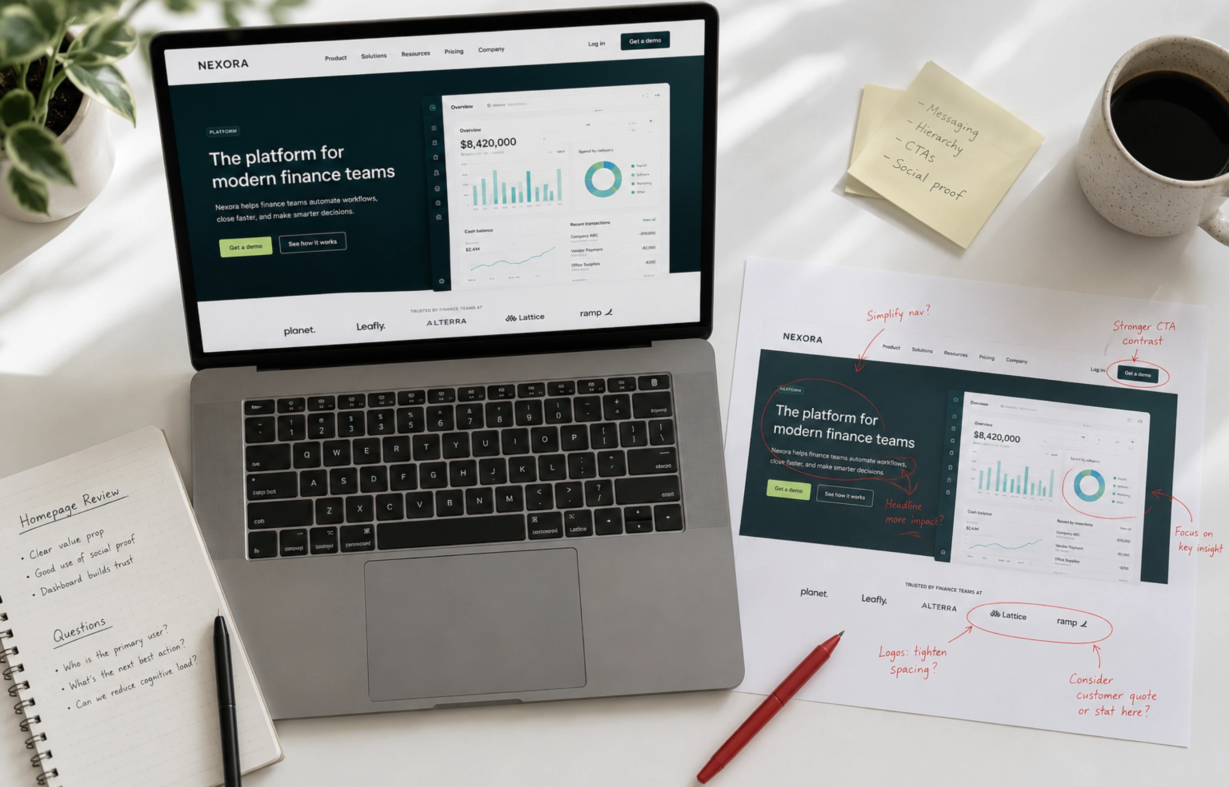
Most service business owners whose websites are not producing enquiries assume the problem is design. The site looks dated, the photography is not great, the layout feels cluttered. So they invest in a redesign and end up, six months later, with the same problem in a more attractive package.
The reason is that the problems costing them enquiries are almost never design problems. They are messaging and strategy problems. The site does not tell the right person they are in the right place quickly enough. The copy describes what the business does rather than what the client gets. The proof is there but buried in a tab most visitors never open.
This post goes through the mistakes I see most consistently when reviewing service business websites, grouped by where they actually live: strategy first, then copy, then the technical issues that compound everything else.
Strategic Mistakes: Where Most of the Damage Happens
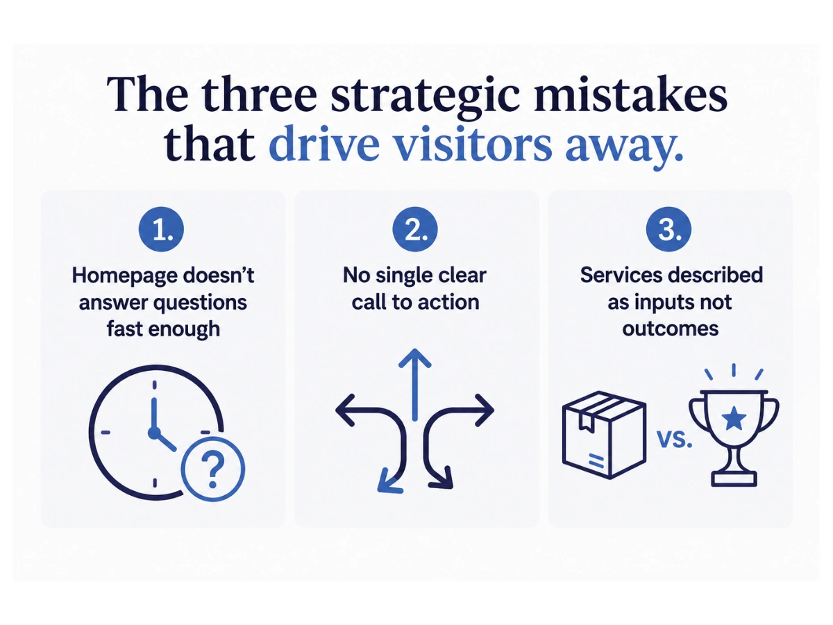
These are the problems that no amount of visual polish will fix, because they determine whether a visitor decides to stay or leave before they have had a chance to be impressed by anything.
The homepage does not answer the right questions fast enough
The first five to ten seconds on a homepage are decisive. The visitor is scanning, not reading. They are trying to answer three questions almost simultaneously: is this for me, can this person help me, and what should I do next. If the homepage does not answer all three in the visible area before scrolling, a significant proportion of visitors leave before seeing anything else.
The most common version of this problem is a hero section that leads with the business name, a tagline that is evocative but vague, and a button that says something like 'Find out more.' The business is present. The visitor is absent. There is nothing in that section that speaks directly to the person who has arrived and needs to be convinced to stay.
The fix is to rewrite the headline so it names the client and the outcome. Not 'thoughtful brand and web design' but 'brand and web design for service businesses ready to attract better clients.' The first tells you what the business does. The second tells the right visitor they are in the right place. That difference drives measurably different behaviour.
There is no single clear call to action
A lot of service business websites have calls to action in the technical sense (buttons exist, links exist) but no clear primary action the site is trying to get the visitor to take. The homepage invites them to book a call, browse services, read the blog, follow on Instagram, and download a resource. Every one of those is a distraction from every other one.
Conversion research consistently shows that reducing the number of choices on a page increases the rate at which visitors take action. A page that asks a visitor to do one specific thing converts better than a page that asks them to choose between five options of roughly equal prominence.
The homepage should have a primary call to action that is visually dominant and placed at the natural decision points: at the hero section, after the services overview, near the proof. Everything else should be secondary or removed entirely.
The services are described as inputs rather than outcomes
This is one of the most consistent patterns across service business websites. The services page lists what is included (a brand strategy session, a visual identity suite, a twelve-page website) rather than what changes as a result. The visitor reads a description of a deliverable when what they need is a description of their situation after the work is done.
A prospect who lands on a services page is not asking 'what do I get?' They are asking 'what does this do for me?' A services page that answers the second question converts at a higher rate than one that answers only the first. The deliverables can follow, but they should follow from a clear statement of the outcome rather than lead with it.
Recognising any of these in your own site?
Book a free discovery call with Hayley and we can take a clear-eyed look at what your website is doing well and where it is letting visitors walk away
Copy Mistakes: What the Words Are Doing Wrong
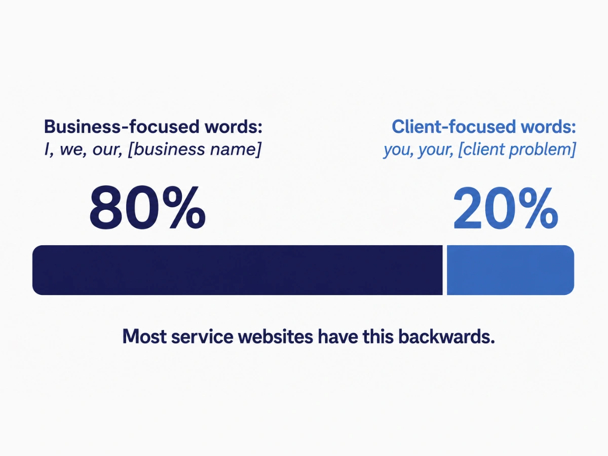
The copy is about the business, not the client
Flip through most service business websites and count the instances of 'I', 'we', and the business name versus 'you' and direct references to the client's situation. The imbalance is usually significant. The copy describes the business (its background, its approach, its values) rather than speaking to the person reading it.
This is not about removing personality from the copy. A business with a clear, direct voice is more compelling than one that sounds like a committee. But the orientation needs to be outward, toward the client and their situation, rather than inward toward the business and its credentials. The credentials can be present, but in service of answering the client's question: why should I trust this person with my business?
The proof is generic and not where it needs to be
A testimonial that says 'Hayley was amazing to work with, highly recommended' is better than no testimonial. But it is not doing the work that strong proof can do. It confirms that working with the business was pleasant. It does not tell a prospective client what changed, why it changed, or whether a similar change is possible for them.
Specific, outcome-focused proof converts better than generic positive sentiment. A testimonial that describes a real before, a real process, and a real measurable after gives the reader something to see themselves in. That moment of recognition (that is my situation, that is the outcome I want) is one of the most powerful things a website can create.
Beyond the content, placement matters as much as quality. Proof belongs on the homepage near the call to action, on the services pages adjacent to the service description, and at any point in the user journey where doubt is likely to arise. Not only on a testimonials page that most visitors never navigate to.
The copy uses language the client would not use
Industry terminology and professional jargon can signal expertise to an audience that shares that vocabulary. For most service business clients, they create distance. A prospect who encounters words they do not fully understand does not lean in to learn. They disengage.
The test is simple: would the person you most want to work with read this sentence and immediately understand what it means and why it matters to them? If not, rewrite it in the language they would use to describe their own problem. The most effective website copy is often the least impressive-sounding, because it speaks directly to a specific person in words they recognise as their own.
Technical Mistakes: The Issues That Compound Everything Else
Slow load speed and poor mobile experience
More than half of website visits in Australia happen on mobile devices. A site that renders poorly on a phone, has text that requires pinching and zooming, or has buttons too small to tap reliably is creating a poor experience for the majority of its visitors before they have read a word.
Page speed has a direct impact on both user experience and search ranking. Google uses page speed as a ranking signal, and visitors abandon pages that take more than three seconds to load at a measurably higher rate. Image compression, platform choice, and hosting quality are the primary levers. Sites with large unoptimised images and heavy plugins are the most common offenders.
Contact information that requires effort to find
A surprising number of service business websites bury the contact page in a secondary menu, have a contact form that has not been tested recently, or provide only a single contact method. The contact page should be one click from anywhere on the site. The form should be short, tested, and connected to a real inbox. And a brief note about what happens after someone submits removes the uncertainty that is a quiet deterrent at the point of contact.
Outdated design that no longer matches the business
Visual design is the last category for a reason. It matters less to conversion than strategy and copy for most service businesses, and it is the most expensive and time-consuming to change. But it does matter at the premium end of the market, where visual impression is part of what sets price expectations.
An outdated design signals that the business has not invested in its own presentation recently, which raises quiet questions about whether it invests in client work. A site that looks five years old when the business is operating at a current standard creates a mismatch that premium clients notice and act on, even when they cannot articulate precisely what bothered them.
What Are the Most Common Website Mistakes Service Businesses Make?
The most damaging website mistakes for service businesses are: a homepage headline that does not immediately communicate who the business serves and what it does for them, no clear single call to action, proof that is vague or buried where visitors do not find it, and copy that describes the service rather than the outcome the client gets. Most of these are messaging problems, not design problems, and they can be fixed without a full rebuild.
Where to Start
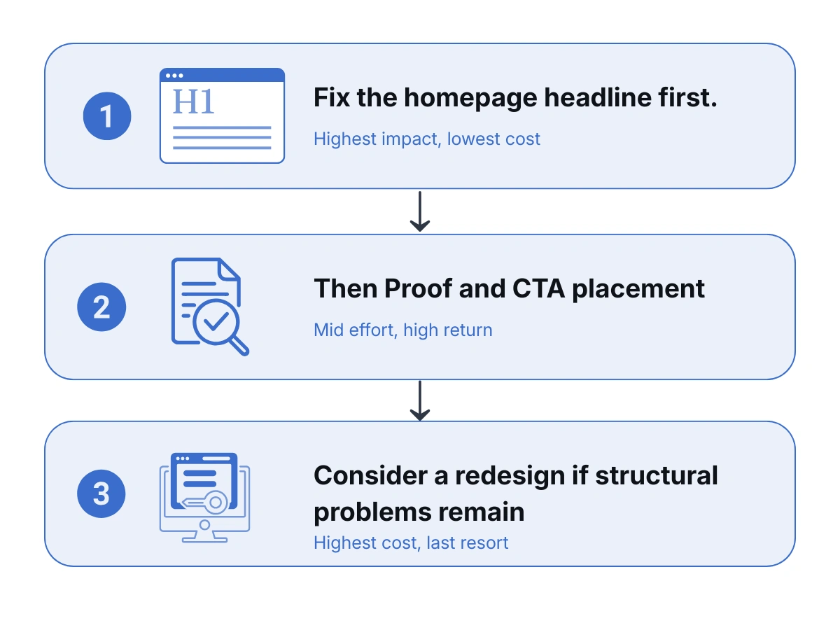
If this post has made you want to look critically at your own site, the most useful place to start is the homepage headline. Read it back as if you are a potential client seeing it for the first time. Does it tell you clearly who this is for and what they get? Does it give you a reason to keep reading?
If the honest answer is no, that is the first thing to fix. Everything else (the services copy, the proof placement, the call to action) can follow once the headline is doing its job. Most of the problems in this post can be addressed without a full redesign. They are copy and strategy problems that sit on top of the existing structure. A full redesign makes sense when the structural problems are deep enough that targeted fixes cannot reach them. Before investing in that, it is worth checking whether targeted changes to the copy and strategy might move the needle first.
Your website is working around the clock. Make sure it is working for you.
At WQ Creative, every project starts with strategy and copy before a single design decision is made. Because a well-designed website with weak messaging will consistently underperform a less polished site that speaks directly to the right person. Book a free discovery call with Hayley.

.png)