What Should a Website Homepage Actually Include? A Strategist's Guide

Most homepage advice comes as a checklist. Add a headline, add some testimonials, add a call to action. The checklist is not wrong, but it misses the part that actually matters: the order those things appear in and the specific job each one is doing at that point in the visitor's experience.
A homepage is not a collection of sections. It is a sequence. Each part exists to answer a question the visitor is asking at that exact moment, and to earn the next few seconds of their attention. This post walks through that sequence in order, the way I think about it when structuring a homepage for a client.
The Hero Section: Answer Who and What Immediately
The hero section is everything visible before a visitor scrolls. It carries more weight than any other part of the page, because it is the only section every visitor sees, and it decides whether they scroll further at all.
Its job is narrow and specific: tell the visitor, within a few seconds, who this is for and what it does for them. Not what the business believes, not how long it has existed, not a clever line that requires interpretation. A name and an outcome, stated plainly.
'Brand and web design for service businesses ready to attract better clients' does this job. A vaguer line, however polished, makes the visitor work to figure out if they are in the right place, and a meaningful number of them will not bother.
The subheading beneath the headline adds context without diluting the promise, and the primary call to action button should already be visible here, even though most visitors are not ready to click it yet. Its presence signals that there is a clear next step, which builds quiet confidence even before it is used.
An Early Trust Signal
Immediately after the hero, before the visitor has had to evaluate anything else, a small trust signal does important work. This might be logos of recognisable clients, a specific statistic, or a single short line of social proof.
The purpose here is not to fully persuade. It is to answer the unspoken question that follows the hero section: is this real, or is this just confident copywriting? A small, credible signal early on lowers the visitor's guard for everything that follows.
Services Framed as Outcomes
Once the visitor knows who this is for and has a reason to trust it is legitimate, they want to understand what is actually on offer. This section needs to resist the urge to list deliverables and instead describe what changes for the client.
A visitor scanning this section is asking does this solve my specific problem, not what is included in the package. Outcome-led language answers that question directly. Deliverables can follow as supporting detail, but the outcome needs to lead.
This section should also make clear, without requiring the visitor to click through, roughly what range of problems the business solves. If the business offers three distinct services, this is usually three short, clearly differentiated blocks rather than one dense paragraph trying to cover all three at once.
Not sure if your current homepage follows this structure?
Book a free discovery call with Hayley. We can walk through your current homepage section by section and see where the sequence breaks down.
Specific, Provable Proof
By this point, the visitor understands what is on offer and is starting to consider whether to act. This is the moment doubt is most likely to surface, and proof is what addresses it.
Generic testimonials do limited work here. A line that says someone was professional and easy to work with confirms a pleasant experience but does not reduce uncertainty about outcomes. What reduces uncertainty is specific, outcome-focused proof: a real before, a real process, a real measurable after. A case study excerpt or a detailed testimonial belongs here, positioned at exactly the point in the scroll where hesitation tends to peak.
Quietly Answer the Objection
Most visitors carry at least one unspoken concern by this point in the page. Is this affordable. Is this going to take a long time. Will I be able to manage this myself afterward. A homepage that ignores these concerns leaves the visitor to resolve them alone, which often means they simply leave instead.
This section does not need to be a full FAQ block. A short paragraph or two, addressing the one or two objections most likely to be live for this specific audience, is usually enough. The goal is to remove friction quietly, not to anticipate every possible question.
A Single, Repeated Call to Action
The homepage should ask for one thing. Book a call, send an enquiry, start a project, whatever the single most useful next step is for this business. Not five different options competing for the same moment of attention.
That one action should appear in the hero section, again after the services overview, and again at the very end of the page. Repetition here is not redundancy. Different visitors are ready to act at different points in the scroll, and the action needs to be available wherever that readiness occurs, in the same form each time so there is no confusion about what happens next.
What Should a Homepage Actually Include?
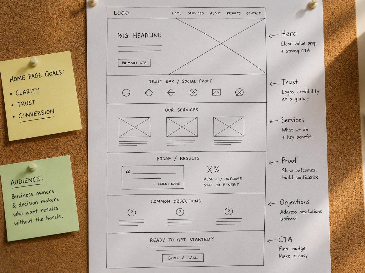
A converting homepage needs six things in a deliberate order: a hero section that names the client and the outcome, an early trust signal, a clear overview of services framed as outcomes, specific proof, an answer to common objections, and a single, unambiguous call to action repeated at the natural decision points. Each section has one job, and the order is not arbitrary. It mirrors the questions a visitor is actually asking as they scroll.
Why the Order Matters More Than the Content
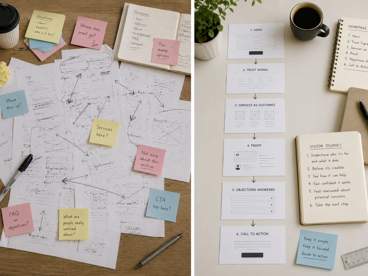
Most of the individual pieces described here already exist on most service business homepages in some form. A headline exists. Testimonials exist somewhere. A contact link exists. What is usually missing is the deliberate sequencing that mirrors how a visitor actually thinks while scrolling.
A testimonial placed too early does little, because the visitor has not yet decided whether they understand the offer well enough to care about proof of it. A call to action that only appears at the very bottom of a long page misses every visitor who was ready to act earlier and found nothing to click. Structure is not decoration. It is the mechanism that moves a visitor from arrival to action.
If your homepage has all the right pieces but is still underperforming, the sequence is the first thing worth examining before assuming any individual section needs to be rewritten.
A homepage built in the right order does more work with the same content.
At WQ Creative, every homepage is structured around the visitor's actual decision-making sequence, not a generic template. Book a free discovery call with Hayley to see what that looks like for your business.