Most service business websites have the right pages. A homepage. An about page. A services page. A contact form. The structure is there.
What is less common is those pages actually doing their jobs. And there is a meaningful difference between a website that has a services page and a website that has a services page that converts.
This post is not a list of pages you need to add. It is an explanation of what each core page is trying to achieve, what tends to go wrong, and what a well-functioning version of each one looks like. If you are building a new site or auditing an existing one, this is the lens that matters.
The Homepage: Answer Three Questions Fast
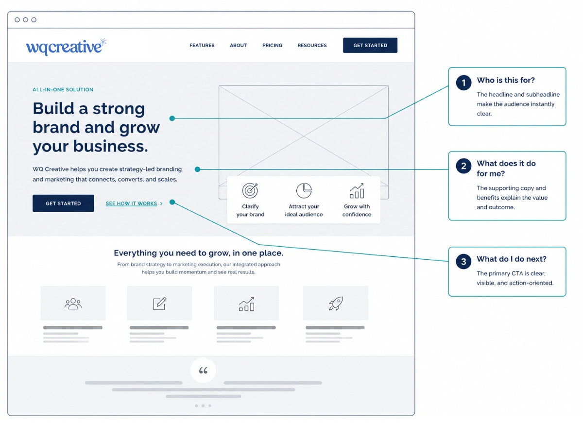
The homepage has one job before any other job: tell the visitor immediately whether they are in the right place. Not eventually. Not after scrolling. In the first few seconds, before they have consciously decided to keep reading.
Those first seconds are governed almost entirely by your hero section, the top portion of the page that is visible without scrolling. If that section does not clearly communicate who you work with, what you do for them, and what to do next, you will lose a significant portion of visitors before the rest of the page has a chance to do anything.
What the homepage hero actually needs
A headline that names the client and the outcome, not the service. 'Brand and web design for service businesses ready to attract better clients' works harder than 'Thoughtful brand and web design' because it tells the right visitor they are in the right place and lets the wrong visitor know this is not for them. Both of those outcomes are useful.
A subheading that adds specific context. One or two sentences that expand on the headline, name the problem you solve, or describe how you work. Not generic. Not vague. Something that a specific person in a specific situation would read and think: that is exactly what I need.
A primary call to action that is singular and clear. One button. One next step. Not three options competing for attention. The homepage can have secondary links further down, but the hero section should point clearly in one direction.
Below the hero, the homepage should move through a logical sequence: an overview of what you do, some early social proof, a more detailed look at your services or process, further proof, and a closing call to action. Each section earns the next. The visitor is being guided, not browsed.
The Services Page: Describe Outcomes, Not Deliverables
The services page is where most service businesses lose the most ground. Not because the services are not good, but because the page describes what is included rather than what changes as a result.
A list of deliverables tells a visitor what they are buying. A description of outcomes tells them why it matters. Visitors do not arrive at your services page wanting to understand your process. They arrive wanting to know whether this will solve their problem. The page needs to answer that question before it explains anything else.
Individual service pages versus a single services overview
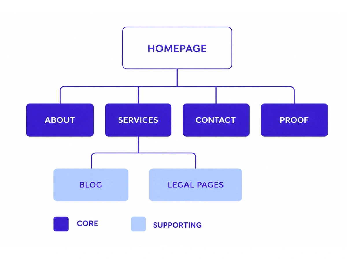
For most service businesses, having individual pages for each core service is worth the extra work. A single page that covers multiple services will almost always be too general to rank well in search, too long to hold attention, and too broad to speak directly to the person who needs one specific thing.
A dedicated page for each service allows you to write copy aimed at a specific client with a specific situation. It allows you to include relevant testimonials from clients who have used that particular service. It gives you a focused call to action. And it gives Google a clear, specific page to rank for service-level search terms rather than a general overview that tries to cover everything.
The main services page can still exist as a navigation hub, giving visitors a clear overview and linking to each individual service. But the real conversion work happens on those individual pages.
Not sure if your services page is describing outcomes or just deliverables?
Book a free discovery call with Hayley. We can take a look at what your current site is communicating and where the gaps are.
The About Page: Build Trust Through Specificity
The about page is consistently one of the most visited pages on a service business website. People want to know who they are about to hire. They want to understand the person behind the work, their background, their approach, and whether they are someone they can trust with something that matters.
The most common mistake on about pages is being either too modest or too biographical. Too modest sounds like: 'Hayley is passionate about helping businesses grow.' Too biographical sounds like a CV, moving through education and previous roles without connecting any of it to the client.
What makes an about page do real work
The about page needs to answer the question a prospective client is actually asking, which is not 'who is this person in general' but 'why is this person the right choice for me specifically.'
That means connecting your background and experience to the outcomes you create for clients. Not just stating that you have ten years of experience, but explaining what that experience means for someone who hires you. What have you learned? What do you do differently because of it? What kinds of problems have you solved repeatedly that most providers in your space have not?
Specificity builds trust far faster than general claims of expertise. A sentence like 'I have spent a decade working exclusively with service businesses and I understand the particular challenge of communicating intangible value' does more work than 'I am a passionate and dedicated designer.'
A strong about page also includes a genuine, professional photograph. Not a stock image. Not a logo. The person who is going to do the work. For service businesses especially, where the relationship is central to the experience, putting a face to the name significantly increases the likelihood of an enquiry.
The Contact Page: Remove Every Possible Barrier
The contact page has the simplest job of any page on the site. Get the person who is ready to reach out to actually do it. The only way a contact page fails at that job is by making the process harder than it needs to be.
Long contact forms that ask for budget, timeline, project description, how they found you, and three other fields before they have even had a conversation create friction at exactly the wrong moment. A visitor who has decided they want to reach out but encounters a demanding form will often close the tab. Not because they changed their mind, but because they felt like they were filling in a job application.
The contact page should ask for the minimum information needed to have a useful first conversation. Name, email, and one optional field for a brief description of what they are looking for. Everything else can come out in the discovery call.
Setting expectations on the contact page
One addition that makes a meaningful difference is a short note about what happens next. How quickly will you respond? What does the process look like from here? Is there a discovery call, a brief, a proposal?
People are more willing to submit a form when they know what to expect on the other side of it. A sentence or two about your typical response time and next steps removes uncertainty and gives the visitor confidence that reaching out is a good use of their time.
Proof: The Page That Most Businesses Get Wrong
Most service business websites have a testimonials page. Far fewer have a testimonials page that actually converts.
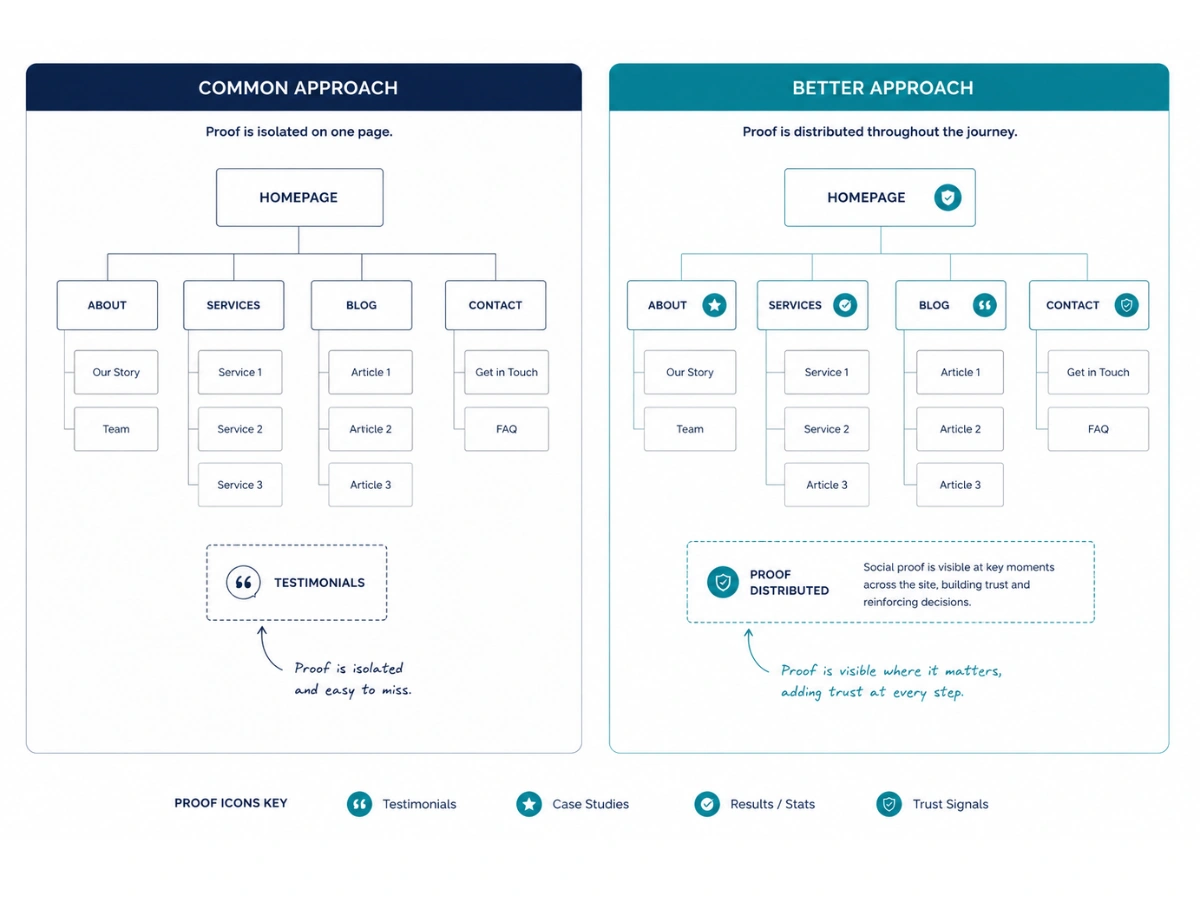
The problem is usually one of two things. Either the testimonials are too generic to be persuasive, or they are buried on a page that most visitors never reach because they are not navigating that far through the site.
What proof actually needs to do
A testimonial that says someone was professional and easy to work with confirms that you are not difficult to deal with. That is a low bar. What converts a cautious prospect is proof that speaks to the specific transformation a client experienced. What was the situation before? What changed? What is measurably different now?
Case studies go further still. A well-written case study describes a real client in a recognisable situation, explains the thinking and approach behind the work, and shows the outcome in concrete terms. A prospective client reading a case study about a business similar to theirs will see themselves in it. That moment of recognition is one of the most powerful conversion mechanisms a service business website can create.
As important as the content of your proof is where it lives. Testimonials that appear only on a dedicated page will be seen by a fraction of your visitors. Proof works best when it is placed close to the claims it supports, on the homepage near the relevant service description, on individual services pages, near the call to action. Treat proof as something that belongs throughout the site, not as a destination page visitors have to seek out.
What Pages Does a Service Business Website Need?
A service business website needs at minimum five core pages: a homepage that immediately communicates who you serve and how, a services page that describes outcomes not just deliverables, an about page that builds trust through specificity, a contact page with a clear and low-friction path to enquiry, and a proof page or integrated testimonials that give visitors the confidence to act. A blog is valuable but only when the core five are working well.
The Blog and the Legal Pages: What to Know About Each
The blog
A blog is not a must-have in the same way the core pages are. A service business with no blog but a clear, well-structured five-page site will outperform a business with a blog and a homepage that does not convert.
That said, once the core pages are doing their jobs well, a blog adds genuine value. It gives Google more pages to index, creates additional entry points for people searching at different stages of their decision, and demonstrates expertise over time in a way that a static services page cannot. It also gives you something to share on social media and in email that points people back to the site.
The condition is that it is done with a clear strategy. A blog that publishes irregularly on generic topics is unlikely to move the needle. A blog with a consistent publishing rhythm and content aimed specifically at the questions your ideal client is already asking can become one of the most effective lead-generation tools on the site.
Legal pages
Privacy policy, terms and conditions, and cookie policy are not optional if you are collecting any user data, running analytics, or using tracking pixels. They protect the business legally and they are increasingly expected by visitors as a basic signal of professionalism.
These pages do not need to be elaborate. A straightforward privacy policy that explains what data you collect and how it is used is sufficient for most service businesses. What matters is that they exist, are accessible from the footer, and accurately reflect what the site is actually doing.
Have all the pages. Not sure they are working?
Most service business websites have the right structure. The question is whether each page is doing its actual job. At WQ Creative, we build sites where every page has a clear purpose and a clear outcome. Book a free discovery call with Hayley to find out what yours might be missing.