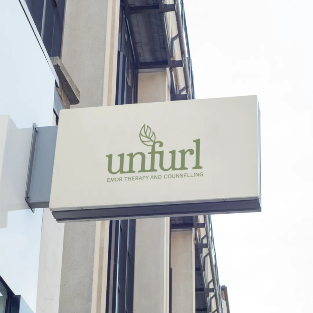
Give Your Brand a Face That Matches Its Ambition
You’re an expert at what you do. Does your brand look like it? We create cohesive, strategic visual identities that build trust instantly and position you as the premium choice.
Is your "look" letting you down?
When you started, you did what you had to do to get moving. You might have DIY’d your logo or picked something simple just to get a business card printed. And that served its purpose perfectly for where you were.
But you’re not in startup mode anymore.
You’re pitching bigger clients. You’re raising your prices. You’re speaking on stages.
The disconnect is real.
If your work is premium but your visuals feel "entry-level," you’re creating friction. You want your brand to open doors, not create doubts. It’s time for your outside to match your inside.
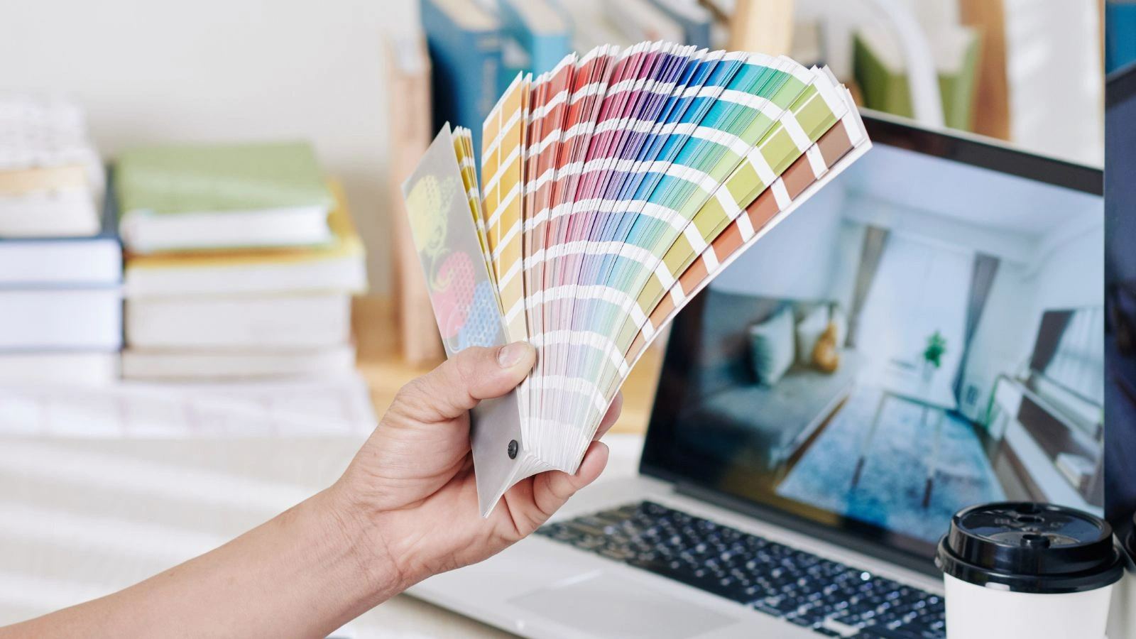
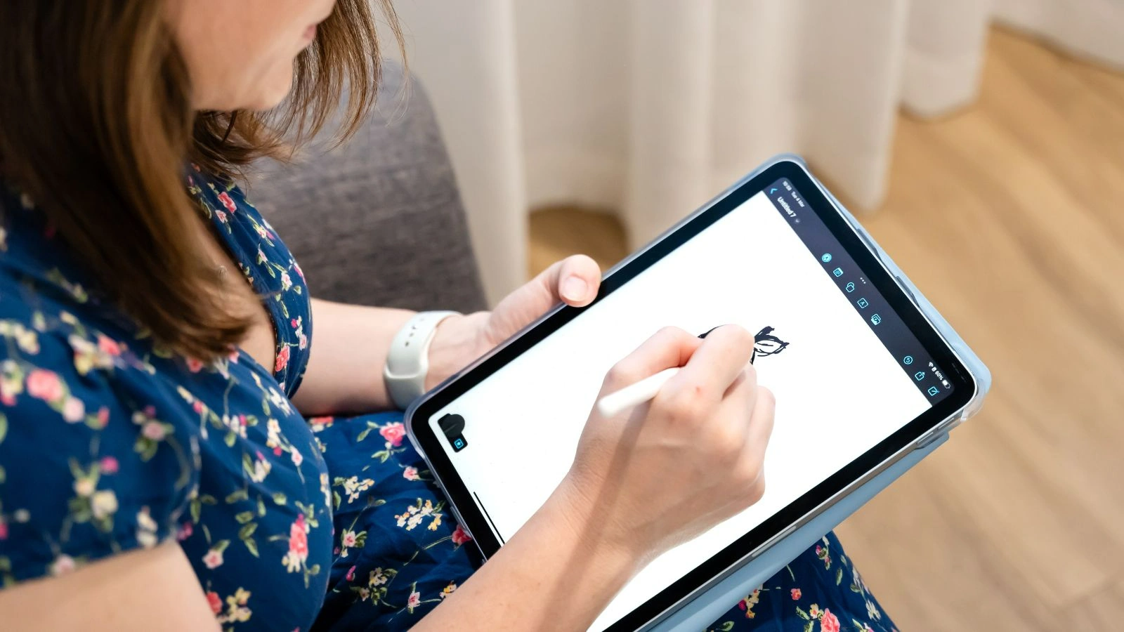
More than just a pretty logo
A logo is not a brand. A brand is a system.
At WQ Creative, we don’t just draw shapes. We build Visual Identities.
We translate your values, your personality, and your strategy into a visual language that your ideal clients instinctively understand.
We design for:
• Recognition: So people remember you in a crowded feed.
• Consistency: So you look professional across every touchpoint.
• Emotion: So your brand feels right to the people who matter.
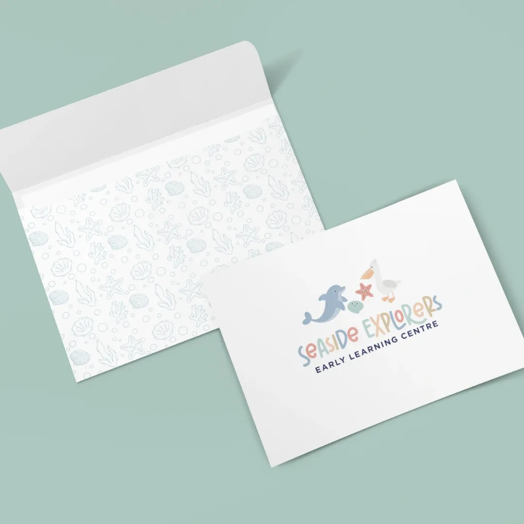
We don't design in isolation.
Your visual identity is built from your strategy, your positioning, your audience, and your brand personality. It's designed to work with your website, not separately from it.
This is how we create brands that feel aligned, intentional and timeless.
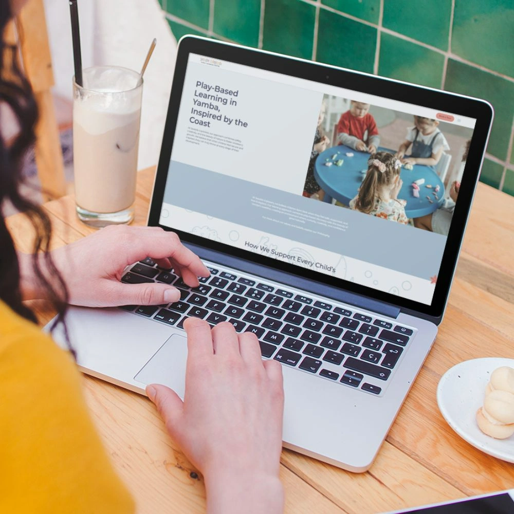
How it Works
The Visual Signature™ is created during Phase 1 of your website project so your branding and website are fully aligned.
We develop your logo suite, your colour palette, your typography, and your visual style - everything built from your brand strategy and messaging.
Your Brand Toolkit
This is added to your website project and delivered as part of your 6-week build.
Your brand will be ready for your website, social media, email marketing, print, and signage.
No more mismatched visuals. No more inconsistency.
- Logo versions (primary, secondary, submark, icon)
- Logo clear space and minimum sizes
- Logo do's and don'ts (what NOT to do)
- Approved logo lockups and variations
- Photography style and direction
- Illustration style (if applicable)
- Iconography style
- Patterns, textures, or graphic elements
- Primary colour palette (with hex, RGB, CMYK codes)
- Secondary/accent colors
- Colour usage guidelines
- Acceptable color combination
- Primary and secondary fonts
- Font weights and styles
- Hierarchy guidelines (H1, H2, body, etc.)
- Web-safe alternatives
- Photography style and direction
- Illustration style (if applicable)
- Iconography style
- Patterns, textures, or graphic elements
Ready to look the part?
Stop hiding behind a brand that doesn’t fit. Let’s create a visual identity that makes you proud to show up.
